So we redesigned AdSnap. Not like a color swap or a new font - we actually went through every page on the site and reworked how things look and feel, especially on phones.
This has been on our list for a while. The original design worked, but it was clearly built desktop-first, and that shows when you're trying to browse listings on a phone while waiting for the bus. Things were too small, spacing was off, filters were annoying to use. You know the feeling.
We finally sat down and did it properly.
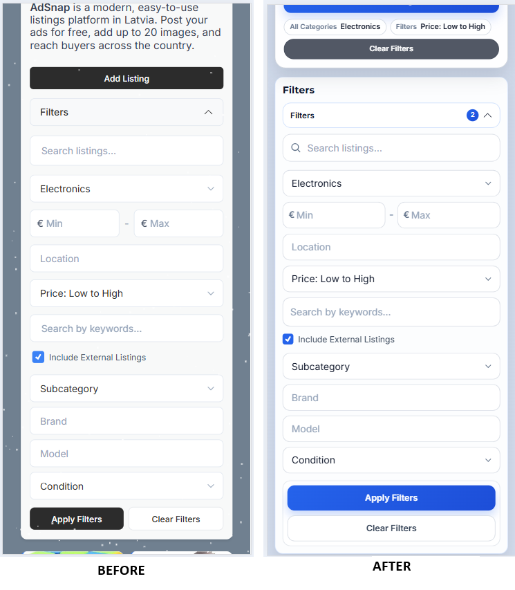
The biggest difference? Mobile.
If you open AdSnap on your phone now, it should actually feel like it was made for a phone. The navigation takes up less space, listing cards are tighter and easier to scroll through, and the filters don't take over your entire screen anymore. You can open them, pick what you need, and keep browsing without losing your place.
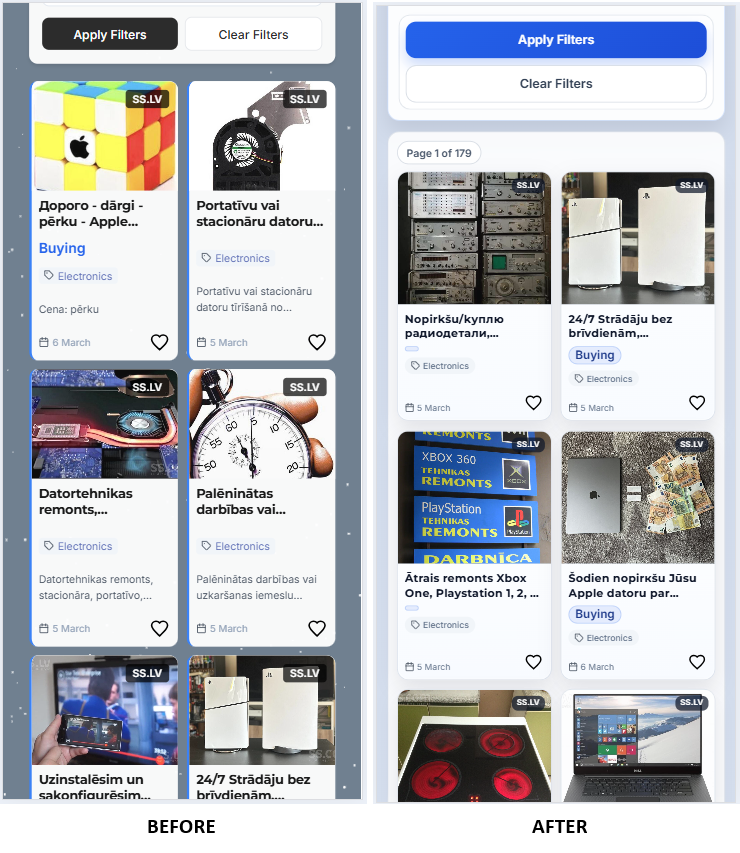
Sounds basic, right? But getting this to feel natural took way more work than you'd think. Every category has different filters, different fields, different layouts. Making all of that work smoothly on a small screen without cutting features - that was the real challenge.
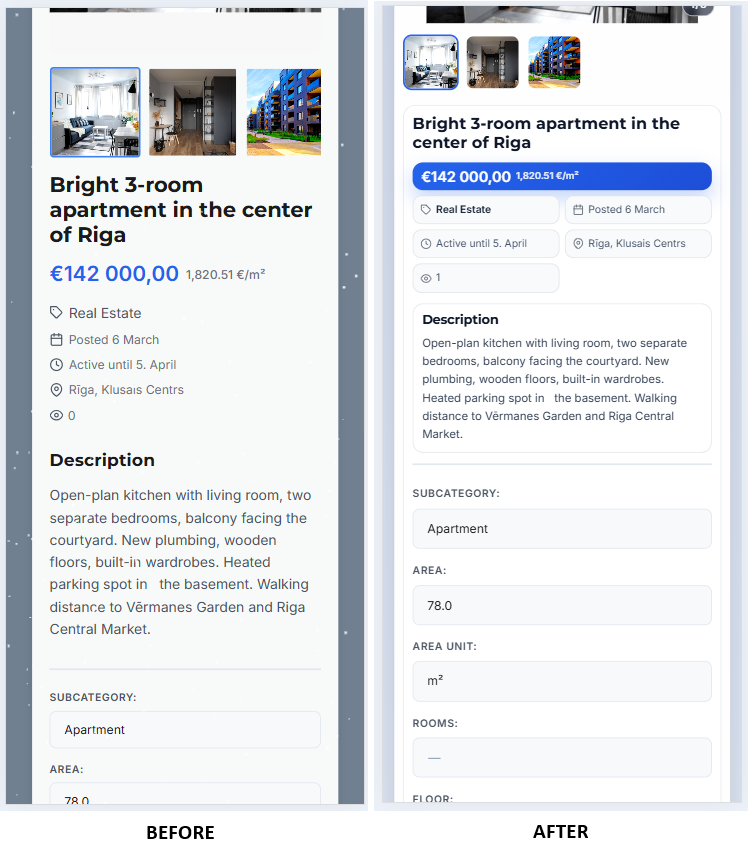
Listing pages got a serious overhaul
This is probably where you'll notice the most change. The old listing detail page had this side panel layout that made sense on a big monitor but was awkward on anything smaller.
Now the photos are front and center. Swiping through them feels smooth, the important info is right where you'd expect it, and the "Chat with seller" button is actually easy to find. Before, you had to scroll around for it depending on your screen size. Not great when that's literally the main action you want to take.
The create and edit listing forms got the same treatment. Cleaner spacing, better field organization, and filling things out on a phone doesn't feel like a chore anymore.
All the other pages too
We didn't stop at listings. Login, registration, password reset - all the account pages now match the rest of the site. Before, some of these felt like they belonged to a different product entirely.
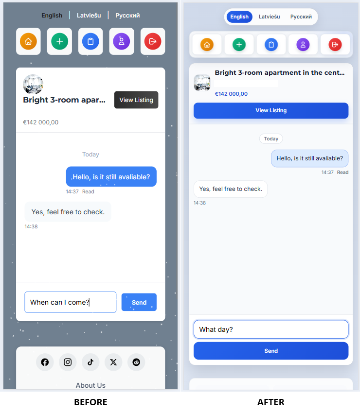
Chat got some love too. If you've had longer conversations with sellers, you might have noticed the message list getting a bit unwieldy on mobile. That's fixed now. The input stays where it should be and the conversation list is more compact.
Even the blog you're reading right now, the contact page, privacy policy - everything follows the same design language. Small thing, but it makes the whole experience feel more put together.
Why are we telling you this
Partly because we're proud of the work. But mostly because if you tried AdSnap before and thought "eh, this feels a bit rough" - it's worth another look. The core was always there - free listings, three languages, solid search filters. Now the wrapper matches the substance.
What's next
We're not done. There are still edge cases in filters that bug us, accessibility improvements we want to make, and probably a dozen small things we'll notice now that real people are using the new design daily.
If something looks off on your device or you run into a weird layout issue - tell us. Seriously. A link to the page and a quick screenshot goes a long way. You can reach us through the contact page.
Thanks for using AdSnap.